xeon
Well-Known Member
- First Name
- John
- Joined
- Jan 18, 2018
- Threads
- 13
- Messages
- 332
- Reaction score
- 251
- Location
- California
- Vehicle(s)
- JLU Rubicon
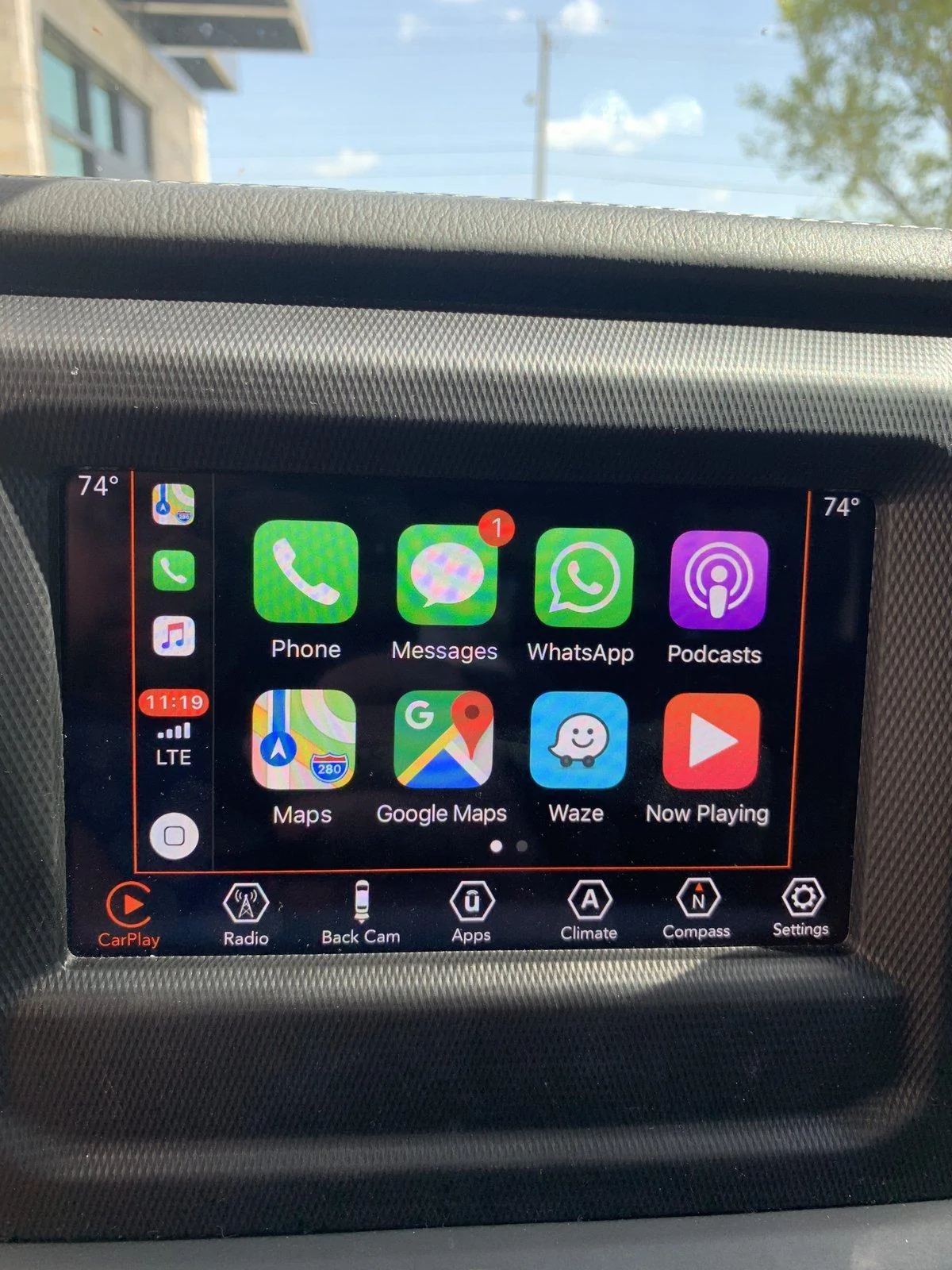
My two cents - so far Apple Play on iOS 13.1.2 is and going back to 13.0.0. has been sort of a stupid update. Great for apple..bad for everyone else. Seems apple is just trying to push everyone to Apple Maps. The dual screen mode is pointless unless it can be fully configured by the user. But I believe that goes for all of it.
1. Side panels with icons, temp and time are pointless and a waste of space....should have an option to remove those
2. dual view mode - which has apple maps, your radio and two dumb buttons for home and work. Here are the problems with this
a. Apple Maps - not going to use it. Have other navigation apps I would rather use. We should be able to select which one we want including the one that comes with our JEEP.
b. Music...ok...what if you rather have that section be an oil pressure gauge or something else.. such turn by turn lists ..give us the option to fill it with what we want. I am sure everyone would like something different but to be stuck with just a music button...no point.
c. The worst part is a third part of the screen containing home and work buttons.....Rather have quick buttons to frequently used
functions on my phone or on the JEEP... i really don't
So as currently configured I will never use this multi view thing. So I am stuck with a screen of icons...which is fine. But take away the recently used icons...they are redundant to the main screen of icons....bad user experience. Mobile App development 101.
Sponsored