Hydroboy35th
Well-Known Member
- First Name
- Josh
- Joined
- Apr 17, 2018
- Threads
- 26
- Messages
- 401
- Reaction score
- 967
- Location
- Zanesfield Ohio
- Vehicle(s)
- 2018 JLR
- Vehicle Showcase
- 1
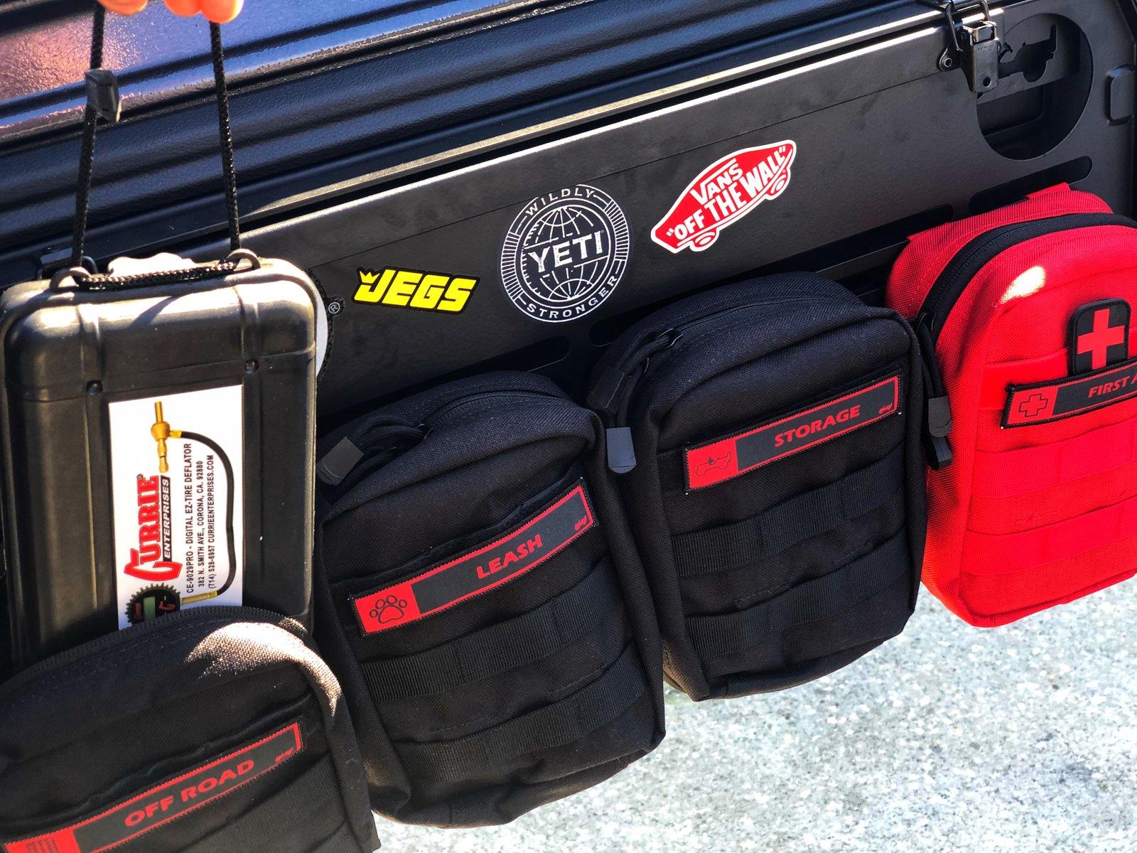
Not to mention the “Roam” logo doesn’t even look good IMO. The “O” is filled in and the “R” doesn’t look cut out all the way. Compare the “Roam” logo to others and its looks real bad.@maxjlu
My pet peeve so to speak is why manufacturers' have to booger up a decent product by putting a logo that stands out like a sore thumb, (in this case an oversize logo) on their product offering. Personally, I think the ROAM logo is overboard. I myself would have painted that friggin thing black.
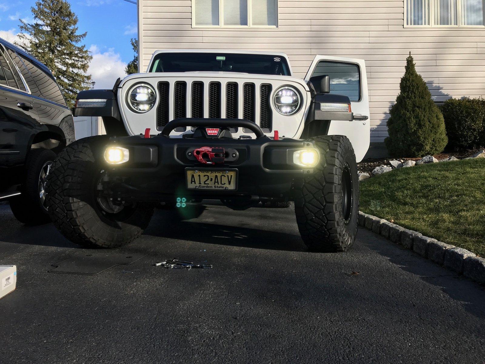
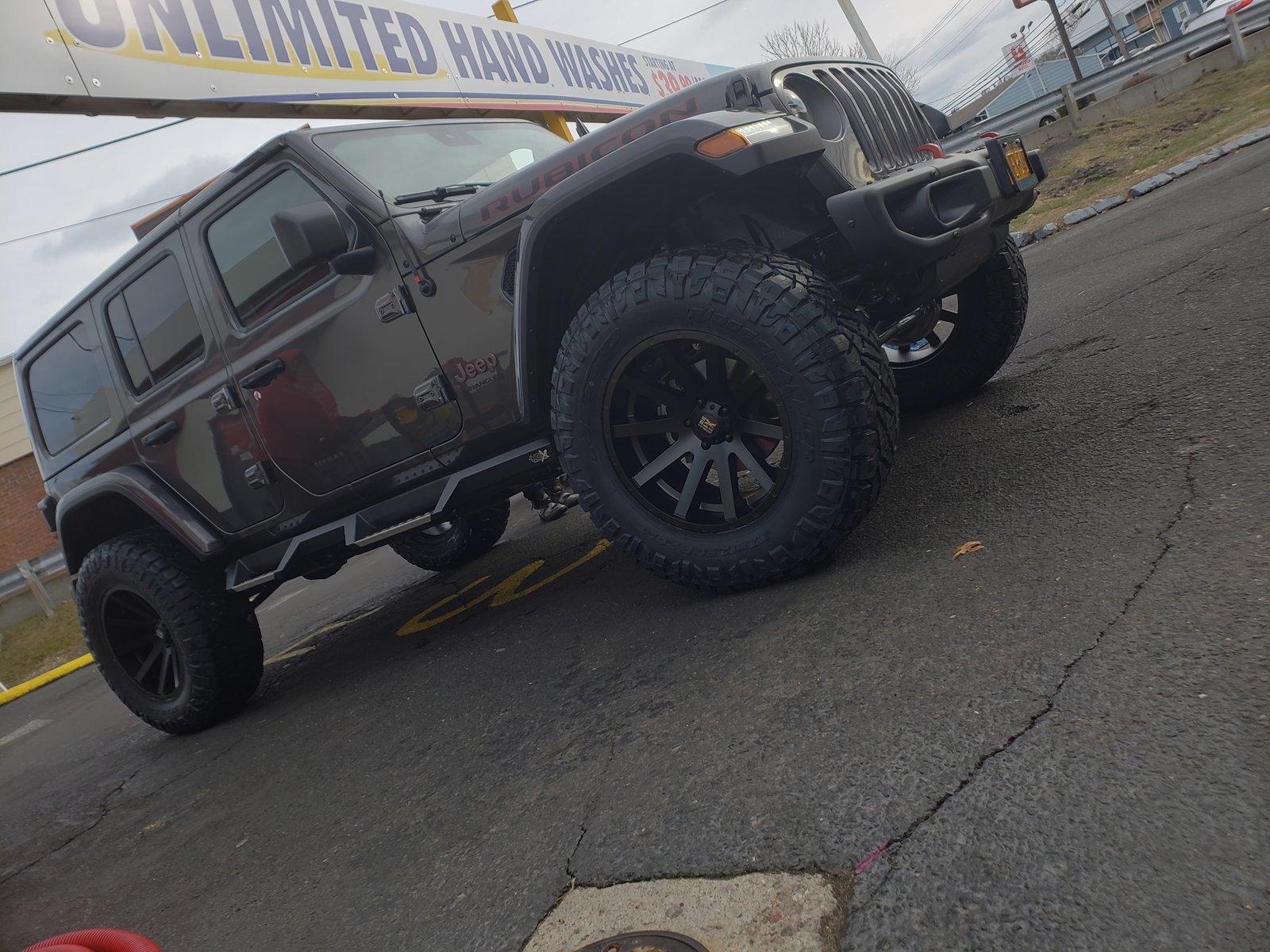
Nice looking JLU, Fred!
Sponsored